More TV art history: the paintings in Downton Abbey are maybe anachronistic?
Posted: February 26, 2014 Filed under: art, tv Leave a comment[Disclaimer: I have no training in or formal education about art history – I’m just an art enthusiast. If I’m wrong about something, please let me know!]
I want to do a post on the art in House of Cards season 2, but first, a quickie on Downton Abbey Season (or “Series,” if you’re British) 4. Notably, the season finale/Christmas special was principally set at “Grantham House,” the Granthams’ house in London.
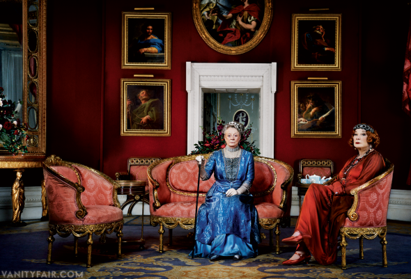
The scenes that took place in this room – the “Octagon Room” of Basildon Park – were perhaps undermined, in my opinion, by this set of distractingly arresting paintings. It really took only the most convoluted of scheming to turn my attention back to the story.
The paintings are by the 18th century Italian painter Pompeo Girolamo Batoni. In the Vanity Fair photo above, clockwise from top left, the paintings depict Saints Thomas, Peter, Matthew, and Philip. I wish this selection of saints serve as a foreshadowing for next season, but I doubt it. Anyway, some interesting stuff is contained in the National Trust descriptions of the paintings; for example, these pieces were not likely to have been exhibited in the time and place depicted in the show:
It is more unusual, as Francis Russell has said, that they should have been painted as a set of pictures for a private collection (though Rubens painted a set for the Duke of Lerma around 1611-12, and Van Dyck another for an Guilliam Verhagen around 1620/21 , for which there were precedents ), and even more so that the major part of one such set should adorn an English country house . If anything – despite the fact that the Apostles were amongst the saints that the Anglican church continued to recognise – sets of Sibyls were more common as an adornment of English country houses than were the Twelve Apostles. One reason for this was, perhaps, that paintings were very rarely collected in England for their content; if anything, they were collected in spite of it (otherwise, not only the profusion of Madonnas and Saints, but also the early English taste for Murillo, with his proliferation of child-angels, would be inexplicable). Yet even in Italy, where these particular Apostles once formed part of the greatest single concentration of Batoni’s work – the Merenda collection in Forlì – it was unusual to commission religious subjects specifically for a picture-gallery as opposed to collecting them après coup – and it normally betokened, if anything, a weakening of religious sensibility, that such was the destination for which pictures of the kind were painted. [Source]
The oval painting shown in the photo above appears to be “Cleopatra, Mark Antony and the Pearl,” by Giovanni Battista Pittoni the younger, a Venetian painter just about a generation ahead of Batoni. This painting also seems a little anachronistic to be included on the Downton set – all of these paintings didn’t come to Basildon Park until the late 1960s. However, it does illustrate an interesting and thematically resonant episode, about Cleopatra’s profligacy, which should maybe be discussed with Lord Grantham.
Somewhat relatedly, I also came across a great blog that discusses anachronisms in dialect and word usage, including an interesting post on Downton Abbey season 4.
What is the real danger of pseudoscience?
Posted: February 25, 2014 Filed under: i believe in science, reading the blogosphere Leave a commentYesterday, a Daily Beast story started popping up on my various feeds: “Whole Foods: America’s Temple of Pseudoscience.” The point made by the author, Michael Schulson, is this: we shouldn’t give creationists a hard time but give a pass to Whole Foods’ unsupported-by-science health claims. That’s a fair critique, and one that’s undoubtedly attractive to members of my contrarian-friendly social circles. But the article makes its point on a set of assumptions that deserve more critical attention: that the primary danger of pseudoscience lies in the entanglement of pseudoscientific ideas with political ideologies.
So, why do many of us perceive Whole Foods and the Creation Museum so differently? The most common liberal answer to that question isn’t quite correct: namely, that creationists harm society in a way that homeopaths don’t. I’m not saying that homeopathy is especially harmful; I’m saying that creationism may be relatively harmless. In isolation, unless you’re a biologist, your thoughts on creation don’t matter terribly much to your fellow citizens; and unless you’re a physician, your reliance on Sacred Healing Food to cure all ills is your own business.
The danger is when these ideas get tied up with other, more politically muscular ideologies. Creationism often does, of course—that’s when we should worry. But as vaccine skeptics start to prompt public health crises, and GMO opponents block projects that could save lives in the developing world, it’s fair to ask how much we can disentangle Whole Foods’ pseudoscientific wares from very real, very worrying antiscientific outbursts.
It’s not clear to me how Whole Foods’ shtick promotes anti-vaccine zealotry – or even, really, what homeopathy is. But it seems to me that the most pressing danger posed by the public’s slippery grasp of science is not that they might get suckered into believing claims on an herbal supplement bottle that haven’t been evaluated by the FDA. Rather, it’s that, increasingly, people in general, and the Republican Party in particular, reject evidence-based analysis wholesale. To my mind, there’s a vast and critical gulf between “we don’t have sufficient evidence to make a conclusion, but we have a hypothesis or functional model based on preliminary results and observations” and “we don’t have any evidence or a hypothesis, we just have a gut feeling based on stories. Kind of old stories.”
Treating creationism as equal to the Whole Foods ethos just perpetuates the problem; i.e., it’s true that we don’t have data that certain chemical substances used in processed foods or consumer products cause adverse human health effects. The reason we don’t have that data is because there isn’t sufficient political demand for it: the regulatory system does not require it, and there is no funding to support public research in this area. Why? In my opinion, the chief reason is that the public doesn’t value science enough – in part because the public discourse assigns false equivalencies like the ones made by Michael Schulson. Creationism creates a positive feedback loop that is profoundly antiscientific; experimenting with plant-based health remedies, or promoting the precautionary principle, does not. The creationist outlook disseminates in society an attitude that devalues the resilience of the scientific method, to the public detriment; Whole Foods peddles some products and makes claims with questionable supporting evidence, but it at least appeals to your interest in evidence.
Don’t call them techies.
Posted: January 22, 2014 Filed under: local politics, the media Leave a commentI was a little surprised to hear Geoff Nunberg on Fresh Air deliver a bit of a rant against the “techies” that have been the subject of the recent “tech class war” in the Bay Area. I would be taken aback by anybody professing on national radio their biased assumptions and prejudices about broad groups of people based solely on the industry in which they work. It is even more unexpected coming from Nunberg, since he teaches lots of budding tech workers at UC Berkeley’s School of Information. I imagine his students might be interested to know that their professor thinks they’re “oblivious” and arrogant.
I think it’s strange how so many people are perfectly happy to assume that all – or most – people who work at a tech company for a living are entitled prats, disconnected from their communities and possessing no social consciousness. (And how interesting that these characterizations are never made about workers of private-busing non-tech companies in the area, like Williams-Sonoma or Kaiser.)
The thing is, normally, you’d assume that these negative assumptions are just made by people who don’t really know any tech workers. But Professor Nunberg does know these people — and he thinks they’re arrogant jerks.
Yet one has to wonder if Nunberg’s analysis and judgments in this area can be relied upon. For example: in one sentence, Nunberg describes Silicon Valley’s hermetic subculture” of nerdy “seclusion,” but in the next, he contrasts this with — surprise! — the fact that many tech workers prefer to live in San Francisco! What could cause these tasteless dorks to insist on moving to our socially conscious, hipster capital? Could it be that they’re actually not the arrogant jerks in search of seclusion that you thought they were? Surely not! It must be their libertarian impulses, urging them to come to the big city and personally evict some teachers and artists.
Nunberg’s description of the buses themselves are also telling:
A “luxury” bus surrounded and blocked by protesters.
People call them all Google buses, because they’re hard to tell apart — oversized Wi-Fi-equipped luxury coaches, usually gleaming white, which scoop up their passengers at transit stops like something out of Close Encounters of the Third Kind. You couldn’t invent a more compelling visual symbol for the privileged and disconnected lives that the tech workers seem to live, cosseted behind smoke-tinted windows.

(Emphasis added.) If the professor is so insulated that he a.) is this impressed by this bus and b.) can’t imagine a better visual symbol for the argument he’s trying to make — well, Occam’s razor again dictates that the simplest conclusion applies: he hasn’t got a very good argument. And maybe he needs to read some history or even, a news site.
Art history in ‘House of Cards.’ (Spoiler-free!)
Posted: February 11, 2013 Filed under: art, original research, tv 3 CommentsThe new Netflix original series House of Cards, starring Kevin Spacey and Robin Wright, has gotten a lot of buzz lately. Much of the attention has focused on its innovative business model, but it’s also been pretty widely critically acclaimed for its writing and acting; Fresh Air‘s TV critic notably called it “the best TV series about American politics since The West Wing” (also now streaming on Netflix).
One thing that seems to have been under-discussed is its great use of art (something which is generally under-recognized in TV criticism in general, I think – see, e.g., the excellent pieces featured in the recently-ended Gossip Girl). Although House of Cards is set in Washington, D.C., it seems that much of the show was shot in Baltimore and its environs. Since Baltimore is the one place that I’ve lived for the most consecutive years since college, it’s pretty near and dear to my heart, and I’ve enjoyed picking out scenes that I recognize and remember from my life there. For example, in one of the first few episodes, Robin Wright’s character goes for a run through Wyman Park Dell, right past a patch of vegetation where my dog often used to poop.
Other scenes seem to take place in and around the Baltimore Museum of Art. In the first episode, a key scene (pictured in the top photo here) occurs where the characters played by Kevin Spacey and Kate Mara have an incognito meeting at an art museum; they trade secrets while staring at a painting of two rowers, while Spacey’s character, Congressman Frank Underwood, talks of how they are now like the figures in the painting: in the same boat. I was intrigued by the painting but didn’t recognize it; I went to Quora to ask if anyone knew who painted it but didn’t get a responsive answer, so finally got around to digging it up myself:

The Biglin Brothers Racing.
The painting is called The Biglin Brothers Racing, by the American painter Thomas Eakins, and it’s in the collection of (and currently on view at) the National Gallery of Art. It was painted in 1872, and the NGA’s page notes that at the time, following the Civil War, rowing became a hugely popular spectator sport. This painting depicts the champion rowers racing on the Schuylkill River, a tributary to the Delaware River, in or around Philadelphia. This seems like it might be an oblique reference to the hometown of Congressman Peter Russo, another character who later introduces a bill related to the Delaware River Watershed (more on that fictional legislation later, perhaps).
In the ninth episode, Zoe and Frank meet again in front of a painting, although their relationship and circumstances are much changed. This time, they sit in front of a very different painting, Little Girl in a Blue Armchair by Mary Cassatt:

Little Girl in a Blue Armchair.
This is a pretty curious composition, and contrasts greatly with the Eakins, even though, interestingly, they are both from about the same time. Little Girl was painted in 1878, just five years after The Biglin Brothers, but the styles are so markedly different that they almost seem to come from different eras. Which makes it all the more interesting, then, that Cassatt and Eakins were not just contemporaries but were both native Pennsylvanians (like Congressman Russo).
I won’t get into unpacking the symbolism of either painting in the show’s narrative, as it’s fairly obvious and I don’t want to spoil the story for anyone who’s just starting. I will say that I think Little Girl is about a girl’s unseen interior life (which, happily, prominently features a dog) while The Biglin Brothers is more about movement and concerted action.
Also, the NGA’s website says Little Girl is not on view, and in House of Cards, it appeared to be hung inside the Baltimore Museum of Art. It looked to me like it was right outside the gorgeous Atrium Court.
There are a lot of amazing specimens of American art hanging in the various politicians’ offices too – maybe a topic for a future blog post. And I’m not an art historical expert by any means, so please chime in if you have corrections or anything else to add!
The hilarious universal blog comment.
Posted: January 29, 2013 Filed under: meta, the internet Leave a comment
What wit!
I’ve brought this blog back from the grand Internet tradition of lifelessness to share this gem that landed in my inbox today. What blog post do you think wouldn’t cause Ian here to lambast you for withholding your cancer-curring energy from the world?
SNL on Linsanity and the media’s inability to deal.
Posted: February 21, 2012 Filed under: asian-american, race, the media, tv Leave a commentLast weekend’s episode of Saturday Night Live hosted by Maya Rudolph opened with a bit on the Jeremy Lin phenomenon, and happily, it was a surprisingly sophisticated take.
As I’ve said before, I have not been crazy about SNL‘s portrayal of Asians in the past, so this is more good news. Given the varied public reaction to Linsanity in general, and ESPN’s horrible “chink in the armor” headline in particular, I can’t help but wonder how many SNL watchers out there didn’t immediately get that the joke was not racial humor itself, but the double standard. If you know me, you may know that one of my favorite hobby horses is when people (usually conservatives) freak out over the alleged excesses of political correctness run amok. If you know me, you probably also know that I am not overly optimistic about humanity’s ability to not be racist, or Internet comments to be anything but cesspools of idiocy. Yet I was still astounded that anybody – including heaps of Internet commenters with handy links to definitions and previous media usages of the phrase – could think that the headline “chink in the armor” could, in this context, be anything but completely unacceptably racist. To complain about the outcry over the headline is to suggest that your obsession with the fantastical political correctness police, or your freedom to be edgy or make asshole-ish jokes, is more important than the ability of Asian-Americans to be free of racial harassment, and that is truly absurd.
Personally, I think what’s most offensive about the headline is that so many people at ESPN apparently failed to recognize that it featured a highly offensive racial slur. Even assuming that the headline writer is not racist and did not intend to pun on a racial slur, he’s still guilty of being ignorant — not that he’s the only one, of course. I grew up in central Connecticut, not far from Bristol, where ESPN is headquartered, and got called “chink” (and taunted with “ching chong” nonsense) plenty of times on the playground in recess and, most memorably to me, in middle school gym class, and not once did the (all white) playground aides, teachers, or other school authorities ever intervene or respond when I complained. I think that’s why it’s important that there be public accountability for this – so that people learn that really, it’s not okay.
The guy at ESPN who actually penned the headline has been fired, although he claims it was an innocent mistake – of course, the issue is, if you accidentally use a colloquialism in the wrong context such that it becomes offensive, you still messed up. And furthermore, if it’s your job to write for the nation’s premier sports outlet, it’s also your job to not make such mistakes.
Back to the point: at The Nation, Dave Zirin summed it up well:
No one at ESPN would talk or write about a lesbian athlete and unconsciously put forth that the woman in question would have a “finger in the dike.” If an African-American player was thought of as stingy, it’s doubtful that anyone at the World Wide Leader would describe that person as “niggardly.” They would never brand a member of a football team as a “Redskin” (wait, scratch that last one.)
Defending the model minority stereotype is true Linsanity.
Posted: February 17, 2012 Filed under: asian-american, race Leave a commentThis is probably only the first blog post I’m going to make about Jeremy Lin, because I’m pretty obsessed with him. (As my boyfriend says, I should just get a poster and hang it up in my locker.) But I’m sticking to my line that the Jeremy Lin story is interesting for good reason, because of how it reflects and magnifies critical issues in society. For example, here’s this opinion piece by NYU History of Education professor Jonathan Zimmerman, published by the Washington Post:
…I’m troubled by the much-heard refrain that Lin — whose parents are Taiwanese immigrants — has “overcome the Asian stereotype.” In the popular mind, this story goes, Asian Americans are quiet, studious and really good at math. By scoring 20 or more points in each of his first six NBA starts, including 38 against Kobe Bryant and the Los Angeles Lakers, Lin supposedly dealt a decisive blow against an insidious ethnic caricature.
But isn’t that stereotype — especially the part about studying hard — a very good model to follow? Why should anyone want or need to “overcome” it?
via In Jeremy Lin, a stereotype that should be celebrated – The Washington Post.
I just don’t know how this Ivy League-educated professor could write this entire 700-word piece without once using the phrase “model minority.” The least you would expect is some brief lip service towards, I don’t know, the problem of stereotypes in general.
Zimmerman makes a good (and topical!) point about the the unfair discrimination against Asian-Americans that is flagrantly practiced at elite universities. But that doesn’t excuse his willful ignorance/incuriousity/unprofessional omission about the many reasons stereotypes in general, and the model minority stereotype in particular, are bad for society.
For starters, the view of Asian-Americans as a monolithic model minority masks the very real needs of the diverse community that falls under the rubric of “Asian-American.” The model minority stereotype also likely plays a role in the high incidence of depression among Asian-American women, and affects the way that Asian-American students learn.
Personally, I can attest that the model minority stereotype has made my own academic successes feel less legitimate, and my own academic failures feel worse. Growing up in a nearly entirely white suburb in Connecticut, where things like athletic virtuosity were admired, the stereotype only compounded my feeling of otherness.
It is probably good for society if virtues like studiousness and hard work are more widely promoted and emulated. But there’s no good reason that it should be done through harmful racial stereotypes.
J. Crew vs. Celine
Posted: February 3, 2012 Filed under: fashion, law, original research Leave a commentLately, I’ve been coveting this gorgeous red satchel version of the Celine Luggage tote seen on Atlantic-Pacific:

She also has a bigger version of the Luggage tote, seen here. However, this purse is far, far outside my budget. But, J. Crew is not! And their new Tillary tote is a great alternative, ringing in at a still substantial $328 – a good digit less than the Celine:
&quality=90&profile=jpeg "J. Crew Tillary tote in warm sienna")
It turns out I’m not the only purse-appreciator who has noticed the similarity. Some have been calling it a knockoff, but I think it’s a legitimate inspired-by reinterpretation.
I was also happy to find that someone else has basically written the blog post I meant to write, on the law of inspiration vs. piracy. According to The Fashion Law, the Innovative Design Protection and Piracy Prevention Act (IDPPPA) would permit this kind of reinterpretation. IDPPPA, introduced by Sen. Schumer of New York and endorsed by CFDA, was apparently reported favorably out of the Senate Judiciary Committee in 2010 but then languished; it has since been re-introduced in the House in the 112th Congress by Rep. Goodlatte of Virginia. I haven’t read and analyzed the bill(s), but the opinions on the Internet are, unsurprisingly, divided: one fashion lawyer/commentator I found thinks IDPPPA will only harm the fashion industry by adding burdensome litigation costs, and that originality standards will be difficult, if not impossible, to prove or enforce. This is not my area of expertise, but from what I’ve read and observed in the arena of art and copyright, courts are extremely ill-equipped to judge what amounts to original reinterpretation, fair use, or artistic appropriation.
Anyways, my foray into the world of purse blogging today has yielded a couple other high/”low” purse observations:
The Reed Krakoff Atlantique tote ($1,490) has a pretty similar silhouette to the Celine:

And compare the Reed Krakoff Boxer in coral or black ($1,290):

…to the Kate Spade Bow Valley Rosa in pink (apparently sold out everywhere) and black ($425, on sale for $297):


2012 Mystery Hunted.
Posted: January 23, 2012 Filed under: personal Leave a commentSince 2005 (and excepting only 2006), I’ve been making the yearly journey out to freezing Cambridge, Mass., to participate in the MIT Mystery Hunt as part of the Simmons Hall team. The Simhunt team changes names from year to year, usually loosely based on themes like waffles or sponges, in tribute to the peculiar architecture of the host dorm; this year, we were Enigmatic Porifera, which is an anagram for something relevant, I’m told.
Yet again, I failed to take good pictures at the Hunt. In fact, this is the only one I took on my camera:

Amy and Bryan, two of our team's fearless leaders, reppin' for Enigmatic Porifera in all-out prom style for one of the events.
There are lots of post-Hunt blog posts and reflections on the Internet (chiefly on Livejournal, for some reason), so I won’t rattle on it about it for too long. The Google+ page is a great resource for finding documentation and what others have been posting on the Hunt. For example, the G+ page helped me find this nice essay on puzzling and the scientific endeavor.
On Our Team (Compared to Other Teams)
This year, like last year, our team was quite small. I’d say we had a core team of about a dozen to 20 solvers, including one remote participant (who was a total rockstar solver). With this small group, we were still able to finish #14 out of 33 teams in terms of total number of puzzles solved [PDF]. In contrast, our performance on the metas [PDF] was quite poor: we only ended up solving 3 (out of 12). Of course, the crucial metric of how much fun we had again went unmeasured, but I think we were definitely at or near the top of the pack.
It seems like a good conclusion with regard to improving our team’s competitive performance overall would be that we need to focus on improving our meta-solving ability. Of course, the trick is that we have to get fast enough at solving the non-meta puzzles so that we have a few solutions to work with.
I suspect that much of what makes the perennially-competitive teams perennially competitive is that they have a larger, deeper pool of solvers at their disposal. Teams like Codex, Manic Sages, and Metaphysical Plant seem to field about 70-150 members each year, including large and effective remote contingents. In contrast, I think we might have had 50-70 puzzlers at our membership peak, maybe 2007ish, which was not to mean that we ever had 50 people working on solving puzzles at one time.

Our team, post-Hunt in 2010.
Our team might be a little atypical in that we are, in recent years, a bit light on actual MIT-ers. This year, almost half of our team were Dartmouth alumni, with our associated useless liberal arts backgrounds. We have fewer MIT alums who can immediately recognize MIT-related clues, and we have fewer (but a few! And awesome!) current MIT students who can run around campus and know where things are. We also have a preponderance of cranky aging nerds who don’t want to get up from sitting at their laptops and therefore generally don’t want to leave the building ever. (I’m not sure if that’s different from how it is on any of the other teams, actually.)
Since our team works out of Simmons Hall, which is a bit remote from the rest of the puzzling action, my teammates and I usually hadn’t had much interaction with the other teams. There was a bit of drama a couple of years ago when some of our stronger solvers left for a more competitive team, but otherwise, the other teams were a complete mystery to me.
This year, I had a friend from Dartmouth who wound up doing her first hunt with Metaphysical Plant – a giant team that put on 2011’s excellent hunt. We got to meet up with her and some of her teammates afterwards and talk to them about how their team works. We learned that they have a pretty solid web-based puzzle productivity/management interface for their team, at least some of which was coded on the fly by a team member at the start of the Hunt. Our team just uses a cascade of Google Docs (back in the day, we had a home brew MediaWiki installation which was probably more trouble than it was worth since many of our solvers weren’t super comfortable with wikis). As result, Jon resolved to work on some kind of web application that should at least theoretically boost our puzzling productivity next year – we’ll see what happens.
The Puzzles! (Spoilers, alert!)
- Both “March Madness” and “Pacific Overtones” called on my hazy memory of things I sort-of learned as a child at Chinese school, which was fun.
- The law nerd in me was super excited when I opened up “Tax… in… Space,” but sadly, it was about 3 in the morning at the time, and I didn’t have enough remaining cycles in my brain to tackle it. I am pleased, however, to learn that the puzzle was authored by a real live lawyer/law professor! I haven’t looked at the solution yet because I’m still hoping to take a crack at it later.
- We totally dominated “Potlines” and “Incredible Edibles,” which is a true testament to the cooking/food obsessiveness on our team. But I will confess that I am still disappointed that “Potlines” was not about stoner movies.
- We spent a while working on “Itinerant People of America” but didn’t crack it, and I’m sorry we didn’t because it’s great. Even though we had a real live linguistics professor working on it, we didn’t figure out that it was a cryptogram of IPA notation! We were really frustratingly close: we did a frequency analysis, we noted the similarity to hobo signs, at least two of us have read and enjoyed John Hodgman’s taxonomy of hobos, we just didn’t put it together. I am really frustratingly bad at that final, key phase of puzzle solving that we call “answer extraction.”
- “Revisiting History” was interesting to me until we quickly figured out it was a Dr. Who puzzle, then I got up and walked away. There’s no accounting for taste. Someone else who knew/cared about Dr. Who solved it later. It’s funny how a theme – and not even a substantive theme – can drive or repel your interest in a puzzle.
Anyway, all in all a wonderful time, and, like last year, am already resolving to practice puzzling more in the interim and already looking forward to next year!
100 hours of juice fast.
Posted: December 14, 2011 Filed under: juice fasting, personal Leave a comment
So, perhaps unsurprisingly, we broke the juice fast a little early. We aimed to go for one week, but stopped after four days. The main reason, if you’ll believe us, is that we were bored. Eating good food is one of the most important and interesting parts of our lives, and fruit and vegetable juices just don’t provide the same variety of tastes (and, of course, textures) that we require to keep ourselves entertained. Juice fasting is also kind of a damper for your social life, since (at least for us) socializing often revolves around food. We even had to skip out on Jon’s work’s holiday party, since we didn’t want to stand around and just watch people eat and drink.
Otherwise, juice fasting turns out to be pretty easily doable. Aside from the boringness of it, the other main issue was simply dealing with hunger. For the first two days, I was hungry a lot of the time, and that was just an unpleasant sensation for which I had not been prepared. After the second day, I wasn’t hungry so much, and my appetite seemed significantly decreased.
However, I never experienced any of the detox effects – extra energy, clarity, etc. – that many people claim to get from juice fasting. Instead, I had a lot of hunger at first, and then I was just easily tired and constantly cold. I also didn’t seem to get any great cleansing in the digestive department. I took one tablespoon of psyllium husks each morning, thinking that the added fiber would help keep my digestion regular, but it had little effect for me.
In terms of weight loss, Jon and I each lost about five pounds in four days. For me, and if our scale is to be believed, most of that was fat. Since we started eating solid food again in the past couple days, I’ve gained about two pounds back (again, fat).
Everyone warns you to be careful about breaking your fast, and ease out of it with small amounts of plant-based foods. We thought about that, but then threw caution to the wind and went to our favorite taqueria to eat quesadillas and crispy nachos. Then, I got a terrible headache and felt horrible. So I wouldn’t do that again. But it does seem to be the case that my decreased appetite is sticking around — even four days after breaking the juice fast, I’m definitely eating smaller amounts of food than I was before. Considering that self-control in the quantity department is probably my biggest challenge in terms of eating healthily, that seems like a pretty good payoff for the effort I put into juice fasting for four days.
I might try juice fasting again in the future, and/or just substituting a juice for a meal once in a while. If I do a full-on fast again, I will probably try to do more research in preparation, since this time we just kind of intuited our way through, with a little help from Google. It was definitely a great way to efficiently consume a lot of fruits and vegetables. I do highly recommend the juicer we got, the Omega J8004 – it was easy to use, easy to clean, take apart, and put back together, and worked well for everything we tried putting in there.

Recent Comments